Yuen, J. 2006. Deriving Decision Rules. The Plant Health Instructor. DOI: 10.1094/PHI-A-2006-0517-01.
Jonathan Yuen
Department of Forest Mycology and Pathology, Swedish University of Agricultural Sciences. Email: jonathan.yuen@mykopat.slu.se
pdf version
1 Why Derive Decision Rules?
1.1 Decision Support Systems (DSS)
The production and availability of decision support systems (DSS) as aids in applying or using disease control methods have become common in contemporary agriculture, perhaps because it has become easier to obtain and process the data that are needed to provide this kind of advice. Another factor affecting adoption of DSS is the ability to reach large audiences with relatively little effort. While increased availability of this kind of information is undoubtedly a benefit for most users, the quality of such information should be sufficient to allow maximization of the economic and environmental benefits that can result from the use of such systems. Thus, other ways of development of such systems could be useful. In addition, clear and objective methods are needed to evaluate and compare different DSS, although the ultimate criterion is adoption by the end-users.
While we tend to think of DSS as something new, possibly connected with computers and the Internet, the concept of predicting diseases and pests predates computers. The Mills rules for predicting apple scab (14) are an example of prediction rules (or risk algorithms as they will be referred to herein) that existed long before the Internet. Other early sets of decision rules include those that were used to predict potato late blight, caused by Phytophthora infestans (9), and Alternaria leaf blight of carrots, caused by Alternaria dauci (5). In these examples, users are given a number of questions related to disease development or risk, and depending on the answers, a number of risk 'points' are calculated. If the sum of these 'points' exceeds a pre-determined threshold, then some sort of disease intervention (often in the form of pesticide application) is recommended.
Where do these risk algorithms come from? Experience and subjective judgment, coupled with revision based on the performance of the rules, is one way in which they can be developed. This can be a lengthy process. For example, 20 years of experience were required for the publication of the Mills apple scab rules (10). Other problems include geographic specificity, variations in host plant resistance, or changes in climatic conditions.
If suitable data sets are available, logistic regression provides a way to verify and calibrate risk algorithms. This is one method by which categorical outcomes (the dependent variables) can be related to a variety of different independent variables, whether these are continuous or categorical in nature. While plant disease epidemiologists like to think in quantitative terms with respect to disease, farmers are often more interested in qualitative outcomes, such as the need to apply a fungicide. Reformulating the question from How much disease will occur?, with a quantitative answer, to a question like Should I spray my field?, with a qualitative answer entails use of different techniques that are covered here. The first part of the following article gives a brief introduction to generalized linear models, how logistic regression represents one type of such a model, and how to program these analyses using SAS. There are other ways to derive these algorithms, but they aren't covered here.
A related issue is how one can judge the performance of the risk algorithm. If these systems are not perfect, there are different types of errors that can be made. The use of receiver operating characteristic curves (ROC curves) is one way of graphically examining the different types of errors. This method also provides a way by which different risk algorithms can be compared. The use of ROC curves is presented in the second part of this article. Finally, the relationship of the performance of the risk algorithm (in terms of specificity and sensitivity) and the probability of disease is determined by a number of factors, but Bayes's theorem provides a method to derive this relationship. The use of Bayes's theorem in disease is presented in the third part of this article. For each section, sample SAS programs and data sets are also available.
This material is presented in two forms:
- The current page is the web browser version for on-line reading, with individual links to illustrative program and data files. The SAS programs and data files are available as a separate archive, or can be loaded individually via this on-line html version. Your browser settings may determine the response to clicking on these links: the file may just be downloaded to the default download location, or may open as a text file, or may open a dialog box asking what you want the file to open up with.
- Click here for a pdf version that will facilitate saving and convenient and consistent printing of the entire document. Download the SAS programs and data files as a separate archive.
1.2 Further Reading
An introductory text on plant disease epidemiology (2) can provide additional background on disease forecasting. Many of the methods used in this article can be traced to clinical epidemiology, which is a branch of medicine, and an introduction to this field (16) could be useful background. An early article on the use of these medical techniques in plant disease forecasting (21) is a shorter introduction to this material.
2 An Introduction to General Linear Models
Generalized Linear Models (12), here abbreviated as GLM (not to be confused with proc glm in SAS which we will use briefly) is a concept that unifies many different types of statistical models. These models include:
- t tests
- Analysis of Variance
- Multiple Regression
- Analysis of Covariance
- Logistic Regression
- Poisson Regression
- Analysis of Dilution Assays
- Probit Analysis
2.1 Components of a GLM
A GLM has several components. These are:
- Random Component: This concerns the dependent variable, and we allow for a discrepancy between observed and 'true' (undoubtedly unknown) values. Traditionally the observed values of the dependent variable are denoted by y.
- Systematic Component: The independent variables. Covariates (usually denoted by xj) and their unknown parameters (usually denoted by βj).
The product of each covariate and its parameter are summed. Assuming we have p covariates:

Mathematically, it is often written like this

Within the context of a GLM, this is often referred to as the linear predictor (LP), and is referred to with the Greek letter η, pronounced eta. Thus,

but I will generally refer to it as the linear predictor.
- Link: A link between the systematic component and the dependent variable. This can be (in simple cases) an identity function (=), where the systematic component (including the independent variables) is equal to the dependent variables plus the error specified by the random component. In other GLM's, this link can be some other mathematical function, such as logarithm, logit, or complementary log-log (CLL). The link is often referred to as g.
Table 1 lists some of the common types of GLM's. Traditionally, t-tests and ANOVA were considered to be different from multiple regression, but the only difference is that the former use categorical independent variables and the latter uses continuous variables. This distinction is discarded within the GLM-concept.
| Analysis |
Random Part |
Systematic Part |
Link |
| t tests |
Normal |
Categorical |
Identity |
| ANOVA |
Normal |
Categorical |
Identity |
| Multiple Reg |
Normal |
Continuous |
Identity |
| Analysis of Cov |
Normal |
Cat. & Cont. |
Identity |
| Logistic Reg |
Binomial |
Cat. & Cont. |
Logit |
| Poisson Reg |
Poisson |
Cat. & Cont. |
Log |
| Dilution Assays |
Binomial |
Cat. & Cont. |
CLL |
| Probit Analysis |
Binomial |
Cat. & Cont. |
Probit |
|
| Table 1: |
Structure of Some Common General Linear Models. | |
2.2 A Simple GLM
A conventional t-test can be formulated as a GLM. We observe a series of values from one of two groups. We assume that these are the result of a random variable and a true mean for each of the two groups. It is assumed that these random variables are independent, and that they have a normal distribution with mean zero.
In the systematic component, we can assign observations to one of two groups. To do this, we use indicator variables (which can take the value of 0 or 1) to assign group membership to each observation. For a t-test the random and systematic parts of the GLM are coupled together with the identity function.
2.3 A numeric example of a simple GLM
Here we will use SAS proc glm to fit some simple GLM's. This procedure uses an identity link function with normally distributed errors and uses 'least-squares' to estimate the parameters. The SAS program is present in the file dagis.sas, and will be shown here in Courier text:
while my comments appear in this font.
All SAS program lines end with a semicolon, and SAS ignores lines that begin with an asterisk. Thus, the following line does nothing but supply us with information.
|
* simple linear regression; |
The next line gives us some printing options. I'll eliminate this material in the future listings, though they will be present in the program files.
|
options linesize=75 pagesize = 64; |
SAS works with data sets, which have to be given names. Here we create a data set called dagis, and read 4 variables directly into it with the cards statement. The four variables are sex (a character variable), wt, height, and ones. The variable ones takes the value of 1 for all observations. Data are arranged in a rectangular matrix, with observations corresponding to the rows, and different variables in each column.
|
data dagis;
input sex $ wt height ones;
cards;
M 17 110 1
M 15 105 1
M 12 100 1
F 15 104 1
F 16 106 1
F 14 102 1
run; |
The next portion of SAS code uses proc gplot to produce some graphs:
|
proc gplot;
plot height*wt;
plot wt*height;
run;
|
The next two statements fit a linear model or GLM. In the first, the dependent variable is height, and the independent variable is wt. This is reversed in the second model. This pattern (the dependent variable followed by the = sign, and then the independent variables) is one we will see in proc genmod. Note that both height and weight are continuous variables.
|
proc glm;
model height = wt;
run; |
We can also fit a GLM with wt as the dependent variable and height as the LP.
|
proc glm;
model wt = height;
run; |
The next model uses the class statement to create indicator variables for sex, because this is a categorical variable. These indicator variables are then used as the independent variables in the model. If we want to see the actual parameter estimates for each of the indicator variables, we need to give the solution option after the '/' in the model statement.
|
proc glm;
class sex;
model wt = sex /solution;
means sex;
run; |
SAS proc glm fits (by default) an intercept term in all models. This can be replaced by our variable 'ones', and the intercept term provided by SAS is removed with the noint option.
|
proc glm;
class sex;
model wt = ones sex /noint solution;
means sex;
run; |
The information provided by the indicator variables together with the intercept term is overlapping (aliased). SAS eliminates one of these variables. In the two previous examples, the aliased variable removed was the last one (i.e. the indicator variable that was equal to one when sex was 'M'). This is only one way (of many possible ways) to deal with the aliasing. If we remove the intercept to avoid aliasing, the model fit is the same, but the parameters are different. In the first two examples with the intercept term, the intercept parameter represents the weight of the boys, and the parameter estimate for the girls is the difference between the weight of the girls and the boys.
|
proc glm;
class sex;
model wt = sex /noint solution;
means sex;
run; |
Without the intercept term, the regression parameters for the indicator variables created for sex represent the average weight of the boys and the average weight of the girls.
Models can also combine both continuous variables and the indicator variables created by the class statement. Interpretation of the parameters from these models is taken up later.
|
proc glm;
class sex;
model wt = height sex /solution;
run; |
In this model, we assume an effect of height on weight, and an effect of sex on weight.
|
proc glm;
class sex;
model wt = height sex sex*height /solution;
run; |
In the previous model, we can also examine an interaction between sex and height in addition to the effect of height and sex.
|
proc glm;
class sex;
model wt = sex sex*height /noint solution;
run; |
The final model is exactly the same as the one before (an effect of sex, an effect of height, and an interaction between them), but we calculate the parameters differently, so that we obtain the intercept and slope of the two lines predicting weight as a function of height, one for the boys and one for the girls.
3. Unconditional Logistic Regression
Unconditional logistic regression (often referred to as logistic regression) is also done with a GLM, but using a different link function and different errors. In this case, the outcome consists of the number of successes that resulted from a given number of trials. For example, we may flip a coin 25 times and note the number of times it shows heads. Assume that it comes up heads 14 times. The number of trials in this case is 25, and the number of successes 14. Since the outcome is a proportion, we can use the binomial error distribution in our GLM. The systematic component can be a mixture of categorical or continuous variables. They must have a linear relationship to each other, but that is true of all linear predictors. In logistic regression, we use the logit (logistic transformation) as the link function.
We define

Plant pathologists and disease epidemiologists will recognize the logistic transformation. For a compound interest disease, a plot of the the logit transformed disease proportion over time approximates a straight line, the slope of which is the parameter r, the apparent infection rate (19). Logistic regression can be used to calculate r if disease incidence is the measure and you know numbers of plants (not just proportions or percent).
In logistic regression, we therefore relate the logit of the proportion to the linear predictor. The discrepancies between the observed proportion of events and the true proportion of events is accounted for by allowing the predicted proportion to have a binomial error distribution.
Figure 1 gives a graphical representation of the logistic transformation. Equipped with the logit (equation 1), you can easily calculate the proportion (equation 2). Note that the logit of zero or one is not defined.
 |
(equation 1) |
 |
(equation 2) |
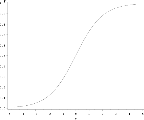
| Figure 1: |
Proportion 'p' as a function of logit(p). |
|
In practice, we can no longer use least-squares (the technique used in proc glm and proc anova) to estimate the logistic models. Most modern techniques rely on a numerical solution, where the initial estimates are continually refined until they can be no longer improved (i.e. maximize the likelihood). The examples presented here are based on proc genmod in SAS, which is much like the original program GLIM (4) originally written to estimate these general linear models.
Proc genmod uses a technique called Newton-Raphson to maximize the likelihood of the regression parameters (the β's in the LP), given the data that were observed. This likelihood maximization is akin to climbing a hill, where a hiker can estimate the position of the top of the hill given the slope and how curved the surface is. This technique also calculates the 'curviness' of the likelihood surface, and this information is used to calculate the standard error of the estimates.
A likelihood curve might look like figure 2, which is from a case control example presented by Ahlbom (1).
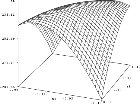
| Figure 2: |
Likelihood surface, with the logarithm of the likelihood (LL) plotted as a function of the regression parameter estimates B0 and B1. |
|
3.1 A Numeric Example
Logistic regression can be used to analyze contingency table data that compare the prediction of disease with the actual outcome. Suppose that the data are arranged as in table 2.
|
Predictor |
|
| True status |
Spray |
Don't Spray |
Total |
| Diseased |
A |
B |
A+B |
| Not Diseased |
C |
D |
C+D |
| Total |
A+C |
B+D |
A+B+C+D |
| Table 2: |
A 2 x 2 table with predictions and actual outcomes. | |
One measure that could be used to evaluate these data is the odds ratio. This would be the odds of disease occurring in the fields where a spray is predicted, compared to the odds of disease occurring in the fields where the sprays are not predicted. This would be calculated as

or

using the information presented in table 2.
This is also the method used for case/control studies in human epidemiology. A detailed description of the rationale behind case/control studies is outside the scope of this article, but in the calculation of the odds ratio, the unequal sampling of cases and controls appears in both the numerator and the denominator, and is thus cancelled out. For further information specifically on these types of studies, an introductory textbook in human disease epidemiology such as Ahlbom's text (1), or Hosmer and Lemeshow (6) would be a good starting point.
We can use the data presented by Jones (8) on the use of disease incidence at growth stage 30 to predict the profitability of a fungicide application, where an application was recommended if more than 20% of the tillers were infected. The data were arranged in a 2 x 2 table (table 3).
|
|
|
predictor |
|
|
|
|
apply treatment |
withhold treatment |
total |
|
True status |
treatment justified |
28 |
13 |
41 |
|
|
treatment not justified |
10 |
7 |
17 |
| Table 3: |
Eyespot predictor. | |
These data would have an odds ratio (OR) of
 |
(equation 3) |
A simple example of such a data set might be one where each line consists of information on a single field. If we choose this arrangement, then the data file would have 58 lines. The first 28 lines (representing cell A) might look like this:
where the 1 represents the true status (a treatment was justified) and dis_pred represents exceeding 20% infected tillers at GS 30.
This would be followed by 13 lines (cell B) like this:
Cell C would be represented by 10 lines like this:
and cell D would be 7 lines like this:
The data file could be read in like this, assuming the data file is called 'eyespot.dat'.
|
data eyespot;
infile 'eyespot.dat';
input true_d dis20 $ ;
atrisk=1;
run; |
This would read in the two variables and create a third, called atrisk, which is always equal to one. We use this as the denominator in the regression. We can perform the regression by invoking proc genmod.
|
proc genmod;
class dis20;
model true_d/atrisk = dis20/link=logit error=binomial;
run; |
In proc genmod we must specify a link function and an error distribution, which for logistic regression are logit and binomial, respectively. The dependent variable consists of two parts for logistic regression. The first is the outcome variable (true_d in this case), and the other is the number of trials. Since each field represents a trial in this data set, this is the variable atrisk, which is always equal to one. The class statement is used with the variable dis20 to create indicator variables. SAS sorts variables in alphabetical order, and thus the nod_pred group becomes the reference group.
The file eyespot.dat and the SAS program simple.sas should be available for you to try this regression yourself. Output from the program simple.sas is presented in figure 3.
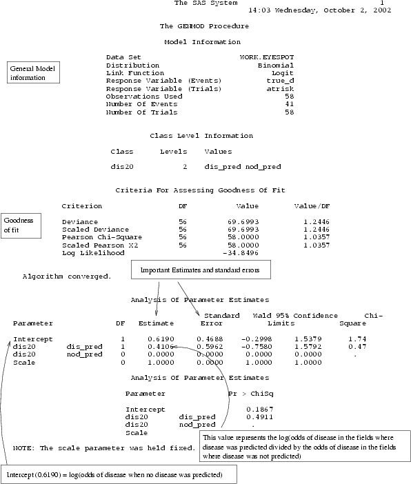
| Figure 3: |
Output from a simple logistic regression from the eyespot data. |
|
The first section presents a summary of the type of model that is being fitted, followed by information on the class variables. Various measures of goodness of fit come next, followed by parameter estimates. One can see that the estimate for dis20 when it takes the value of dis_pred is 0.4106. This is the natural logarithm of the odds of disease exceeding the economic threshold in those fields where disease was predicted, compared to the odds of disease in the fields where disease was not predicted. As would be expected,

which is the same as what we get from calculating the odds ratio by hand. (equation 3).
The odds of disease exceeding the economic threshold for those fields where there was no prediction of disease is

This number can also be found in the SAS output as as the intercept term, although the number presented is the natural logarithm, i.e.

3.2 Another Numeric Example of Logistic Regression
In this example from a book for ecologists (3), the data are grouped, so that we have a number of trials, and a number for the outcome on each line. In addition, we need the independent variable. This was an experiment where approximately 40 insects were placed in petri dishes, and exposed to varying levels of a chemical. After a fixed period of time, the number of insects killed by the chemical were counted.
Here we read the file dishes.dat and have the variables dose (a continuous variable), the number of dead insects (the dependent variable) and the variable initial (the number of insects placed in each dish). In addition we create a second dependent variable by calculating the natural logarithm of dose.
The data file dishes.dat is an ordinary text file that looks like this:
|
1 2 40
2 4 40
5 8 38
10 11 40
20 19 39
50 28 40
100 38 40 |
The SAS code to read in the data looks like this:
|
data bugs;
infile 'dishes.dat';
input dose dead initial;
ldose = log(dose);
run; |
We then run proc genmod. The dependent variable has two parts, the outcome (dead) and the denominator (the number of trials, in this case the variable initial). This is followed by the dependent variable (dose), and then a slash (/). We then tell genmod which link function we are using (logit link) and what error distribution we are using. Binomial errors can be abbreviated with the letter b.
|
proc genmod;
model dead/initial = dose /
link=logit error=b;
run; |
Output is presented in figure 4. Since there was no class statement, this information is missing from the output. In addition, the regression parameter for dose (which is a continuous variable here) represents the change in the logarithm of the predicted odds of an insect dying as the dose changes.

| Figure 4: |
Output from a simple logistic regression from the insect data. |
|
|
proc genmod;
model dead/initial = dose /
link=logit error=b;
run; |
Crawley also suggested fitting the logarithm of dose as the independent variable. This is easily done with the following SAS statements, and the output can be seen in figure 5.
|
proc genmod;
model dead/initial = ldose
/link=logit error=b;
run; |
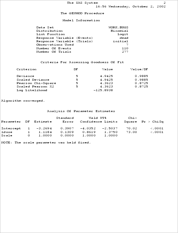
| Figure 5: |
Output from insect data with logarithm of dose as the independent variable. |
|
The sas programs for reading the data and fitting these models can be found in the file bugs.sas.
4. Logistic Regression with Several Variables
In practice, we have several independent variables. The simplest multivariate models might only have one additional variable, perhaps some sort of blocking factor. Here is a simple example with measurements of plant damage at different ozone levels (11). Beans were exposed to 3 levels of ozone in growth chambers with 4 different sections in each chamber.
|
|
Chamber section |
|
|
|
|
|
|
|
|
| Ozone (in ppm) |
Injury |
A |
B |
C |
D |
|
|
|
|
|
|
|
|
| 0 |
low |
54 |
50 |
39 |
53 |
|
| 0 |
high |
9 |
12 |
19 |
10 |
|
| 0.20 |
low |
11 |
15 |
9 |
5 |
|
| 0.20 |
high |
36 |
52 |
61 |
47 |
|
| 0.40 |
low |
3 |
1 |
2 |
1 |
|
| 0.40 |
high |
56 |
63 |
62 |
46 |
|
| Table 4: |
Stratified data for logistic regression. | |
The data can be read directly into SAS using the cards statement. The data and the analyses are in the file strata1.sas.
|
data ozone;
input ozone status $ section $ number ones;
injury=(status='high');
cards;
0 low A 54 1
0 low B 50 1
0 low C 39 1
...more data lines follow |
In this case we input the data with two additional variables. The first is a frequency variable indicating the number of plants. The other one is the section of the chamber. We also create a binary variable that takes the value of 1 when the injury is 'high' and is otherwise 0. The original data appear in tabular form in table 4.
To perform an analysis with these data using genmod, one can use the freq statement to indicate that the variable number represents the frequency of that observation. We then run two models, one with only section, and another with both section and ozone exposure in the class statement (to create indicator variables for both) and in the model statement.
|
proc genmod;
freq number;
class section ;
model injury/ones= section ozone/
link=logit error=b ;
proc genmod;
freq number;
class section ozone;
model injury/ones= section ozone/
link=logit error=b ;
|
The SAS program strata1.sas gives us regression results for two analyses. The first one presents only the results of including the chamber section as an independent variable (figure 6).
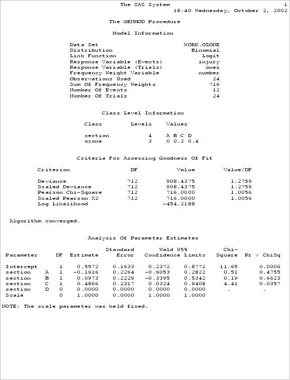
| Figure 6: |
Output from the ozone data with only chamber section. |
|
The second page (figure 7) shows the effect of including both ozone and chamber section in the analyses.
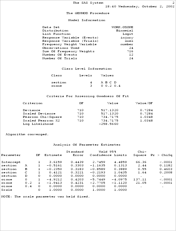
| Figure 7: |
Logistic regression with both section and ozone included. |
|
We can perform a likelihood ratio test (table 5) to determine the importance of the variable 'ozone' We do this by calculating the difference in -2 times the log-likelihood between the two models, and then comparing this amount to a χ2 distributed variable, with the number of degrees of freedom equal to the difference in degrees of freedom between the two models.
| Model |
-2 x log(Likelihood) |
d.f. |
| Section |
908.4375 |
712 |
| Section plus ozone |
517.1320 |
710 |
|
|
|
| Difference |
391.3055 |
2 |
|
| Table 5: |
A Likelihood Ratio Test for ozone exposure, adjusted for section. | |
The difference between the two models is then checked against a χ2 distribution. In this case, we hardly need to look at a table, since the difference (391) is highly significant with only two degrees of freedom, indicating that ozone affects plant damage.
5. Deviance and Goodness of Fit
A model attempts to replace the observed y's with fitted values. In general, these fitted values do not agree exactly with the observed values. It is quite easy to see that small discrepancies are permissable, whereas large ones are not.
We can think of model construction as a process where more and more variables are added to the LP. The simplest model has only one parameter, representing the mean value. The most complicated model has one parameter for each observation. The simplest model (the mean only) generally gives little insight into the processes behind the data. The most complicated model (often referred to as a saturated model) is also of little use, since it merely replaces the observations themselves with an equal number of regression parameters. Since the goal of our statistics is to condense the information, this full model is, in practice, of little use.
For a given set of data, there will be larger discrepancies for the simpler model, and smaller discrepancies for the more complicated models.
There are a number of different measures of goodness of fit but the ones most commonly used in GLM's are the deviance and Pearson χ2.
The deviance is formed from the logarithm of the ratio of two likelihoods. One of these is the likelihood of the current model. The other is the likelihood of the saturated model. Deviance (D) is calculated as follows:

Where current and saturated are the likelihoods of the current and saturated models, respectively.
Note that we can manipulate this formula so that

In practice, if we have single fields (as in the eyespot data) or plants (such as the ozone data) in each strata, so that the number 'atrisk' in each observation is equal to 1, the likelihood of a saturated model is 1, and the deviance reported for the model equals 2 times the log likelihood of the current model. If we have grouped data (such as the insect data), the likelihood of the saturated model is no longer 1. If this is the case, then the 'deviance' reported by SAS is no longer equal to -2 times the log-likelihood.
These represent the two ways in which data for logistic regression can be entered. In practice, if we confine the likelihood ratio statistics that we calculate to the differences between two models, it matters little which way we enter the data. Where it makes a difference is in the interpretation of the residual deviance figure from a single model. If we have data observations consisting of many trials with a given number of outcomes as the dependent variable (i.e. the denominator in the model statement is not one), then the residual deviance is a reasonable indicator of goodness of fit. If this is not the case, and the data consist of single trials, then the goodness of fit must be determined by some other means. One of these is the Hosmer-Lemeshow test, which is covered in their book (6).
The other measure of goodness of fit is the Pearson χ2 statistic which takes the form

where V ( ) is the variance function for the distribution. For the normal link, this is the residual sums of squares, but for the binomial or poisson error, this is the original Pearson χ2 statistic.
Either of these can also be divided by the scale parameter in the case of over-dispersed data.
6. A Detailed Analysis with Analysis of Deviance
In practice, one often has many different variables, some of which may be related to each other. This means that variables that are insignificant by themselves may become significant when others are added. The opposite may also occur, in that variables may contain similar information, so that they are significant by themselves, but lose significance when the related variables are added. In either case, this means that the results of a single regression is often insufficient to evaluate which variables should be included.
6.1 An initial look at the data
A strategy that is often used (at least for the initial selection of variables in a regression) is to fit all the variables by themselves at first, and then include all the variables in a regression. A suitable subset of variables can then be selected, based in part on significance level by themselves or together with other variables, in part on subject-matter considerations and then tested in a model.
Another strategy is to add the variables to a model, making it increasingly complex. Still, one must use the subject matter considerations in adding the different variables.
One extra feature in the SAS genmod procedure that makes this easier is the type1 and type3 options that can be included at the end of the model statement. These generate tables that describe the change in deviance that roughly corresponds to the type1 and type3 sums of squares on other SAS procedures. The type1 table describes the changes in deviance as variables are added to the model (the order being the same as that in the model statement), whereas the type3 table documents the changes that occur when the variable is added last.
For this example, we use the data on occurrence of Sclerotinia stem rot (caused by Sclerotinia sclerotiorum) in canola. Consult the original paper (21) for additional details about this study. The data are available in a text file risk.txt and values are delimited by the tab character. It can be read in with the following statements which can be found in the file can_rd.sas.
|
data riskset;
infile 'risk.txt' lrecl=200 firstobs=2
delimiter='09'x;
* the data are tab (09hex) delimited;
input nr ycd teear omr $ raps $ qual $
angr nyr $ p_inf $ peas $
foliage $ june $ rain2 $ forec $
apo_r $ tidan aponum nr2;
if nyr = 'a' then nyr = 'b';
* number of years 1-4 years highest risk group;
if p_inf = 'd' then p_inf='z';
*make 0 last time reference prev inf;
if apo_r = 'a' then apo_r='b';
*condense ref group to 0-5 apothecia;
angr2 = angr*2;
if angr > 20 then need = 1;
else need = 0;
at_risk=1;
run; |
Recoding of some of the variables also takes place in this data step, and the dependent variable, need, is established. A simple model to examine the effect of one of the variables (nyr in this case) would then appear as the following
|
proc genmod;
class nyr;
model need/at_risk = nyr /
link = logit
error = binomial
type1;
run;
|
You could load the file can_rd.sas and type in the above lines to fit this model. Since much of the programming is repeated for the single variable models, however, there is another approach to fitting these variables. In the file can_single.sas there is a SAS macro that is used to run the single variable models
|
%macro onefit(varname);
proc genmod;
class &varname;
model need/at_risk = &varname /
link = logit
error = binomial
maxit=100
type1;
run;
%mend; |
This macro is then used as follows, saving us a little writing, though the output is not shown here. For the sake of simplicity (if one can consider 6 variables simple) we focus our attention on only a subset of of the variables. These can be fit with the remainder of the program in can_single.sas.
|
%onefit(nyr); * number of years since last crop;
%onefit(p_inf); * previous infection level of last crop;
%onefit(foliage); * foliage density;
%onefit(june); * rain in june;
%onefit(forec); * weather forecaset;
%onefit(apo_r); * apothecia development; |
This is a rather lengthy output, and we should direct our attention on the explanatory value of each of the variables when fitted singly. This information is summarized in table 6. The importance of each of the variables is judged by comparing the deviance change against a χ2 distribution.
| Variable |
Deviance Change |
d.f. |
| nyr |
01.10 |
2 |
| p_inf |
18.28 |
5 |
| foliage |
12.39 |
2 |
| june |
40.62 |
2 |
| forec |
12.61 |
2 |
| apo_r |
51.08 |
2 |
|
| Table 6: |
Deviance changes from fitting the variables singly. | |
From the results of this table, we might suspect that all but one of these variables are important. The exception is the number of years since the last crop, which had a change of deviance of only 1.10 with 2 d.f.
A full model with all six variables and the type3 analysis is then next,
|
proc genmod;
class nyr p_inf peas foliage june forec apo_r;
model need/at_risk = nyr p_inf peas
foliage june forec apo_r/
link = logit
error = binomial
maxit=100
type3;
run; |
This program (can_all.sas) gives us the output shown in figures 8 and 9.
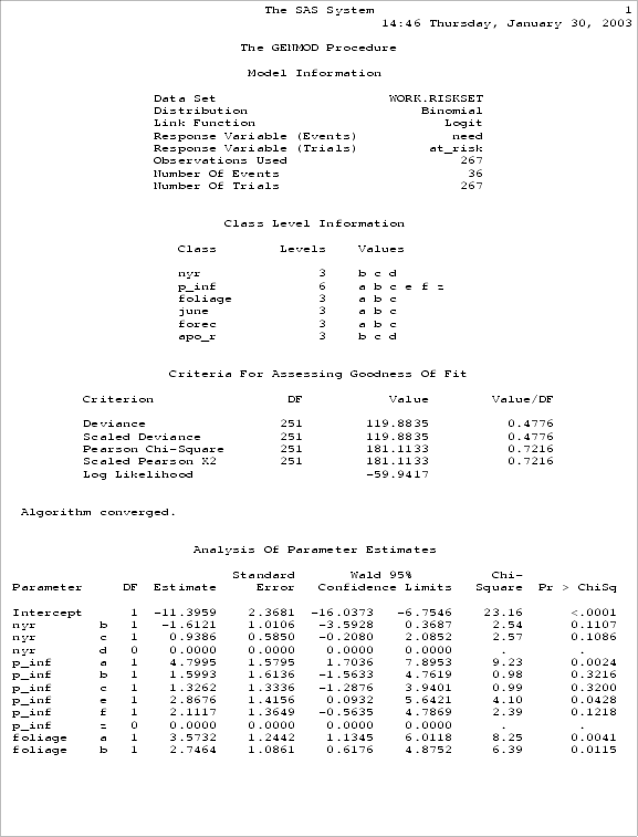
| Figure 8: |
Output from regression with all variables (page 1). |
|
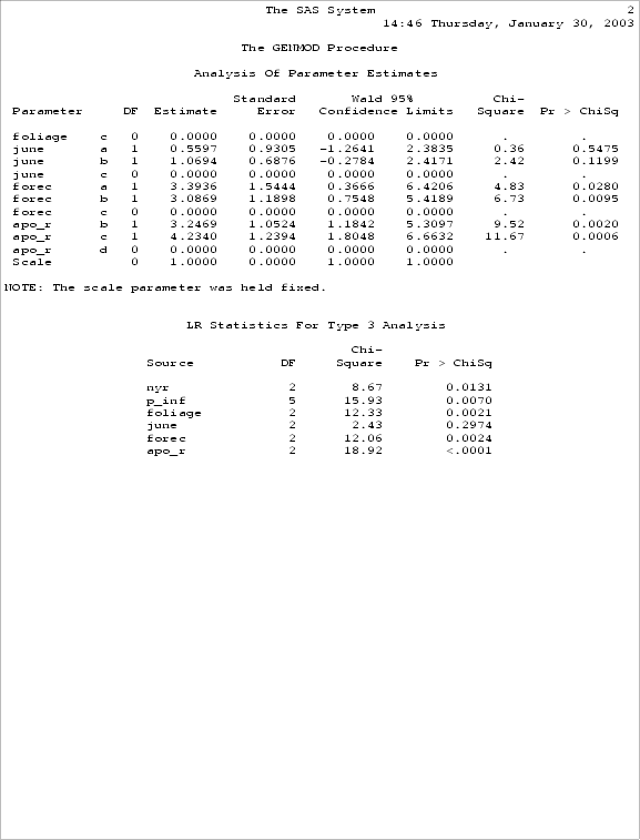
| Figure 9: |
Output from regression with all variables (page 2). |
|
6.2 Towards a full model
If we look at the last part of figure 9, we can see that some variables (such as nyr and p_inf) are significant, whereas as june is not. Surprisingly the variable associated with the number of years since the last crop has become significant, and can now change the deviance by 8.67 when it is entered last into the model. It is obviously confounded with some of the other variables.
From the single variable analyses and the preceding discussion about the rain variable, the variables p_inf, foliage, forec, and apo_r should be included in the model. One might try a reduced model, removing the variable june, to see if the variables that are important retain their significance even in the absence of the june variable.
This can be fit by the model included in the program can_red.sas:
|
proc genmod;
class p_inf foliage forec apo_r nyr;
model need/at_risk = p_inf
foliage forec apo_r nyr/
link = logit
error = binomial
maxit=100
type3 type1;
run;
|
The output from this reduced model is presented in figure 10 and 11.
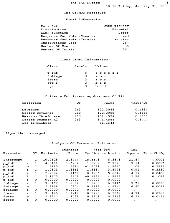
| Figure 10: |
Output from regression with a reduced set of variables (page 1). |
|
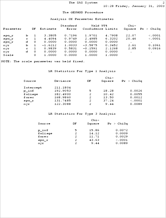
| Figure 11: |
Output from regression with a reduced set of variables (page 2). |
|
Examination of the output from the reduced model reveals that all variables are still significant, and confirms the rationale behind the omission of the variable corresponding to the rain in June.
An analysis of deviance table (table 7) can be constructed from the type 1 analysis table, but since there is internal correlation among the variables, one must remember that the actual changes in deviance reported are dependent on the order in which the variables are fit. Here the residual deviance is the unexplained variation after fitting a model, and the change in deviance is the difference between that model and the previous one. The latter is compared to a χ2 distribution as a significance test.
| Model |
Description |
Residual Deviance |
d.f. |
change |
P |
| A |
Intercept only |
211.1804 |
|
|
|
| B |
A + p_inf |
192.9053 |
5 |
18.28 |
0.0026 |
| C |
B + foliage |
182.4900 |
2 |
10.42 |
0.0055 |
| D |
C + forec |
168.9860 |
2 |
13.50 |
0.0012 |
| E |
D + apo_r |
131.7485 |
2 |
37.24 |
<0.0001 |
| F |
F + nyr |
122.3088 |
2 |
09.44 |
0.0089 |
|
| Table 7: |
Analysis of Deviance. | |
Fitting models is partly art and partly science. There are no hard and fast rules as to how it should be done. Knowledge of the biology of a particular situation is likely to be the single most important factor in the model-fitting process, since one wants a model that makes biological sense. Even aspects such as significance level, however, are not fixed in stone. While we readily use a significance level of 5% without too much questioning, one can argue why it should be just 5 and not 4 or 6 percent instead. An alternative is to examine probability levels instead of merely describing things as significant or not.
7. Receiver Operating Characteristic Curves
Receiver operating curves can be used as a method to compare predictions for disease (21). The curves can provide information regarding how often the predictions are correct (and incorrect), and provide a graphic method of comparing different predictions systems.
Assume that a disease prediction algorithm can produce a range of values. This could result from varying weights or points being given to the various answers from certain questions, such as number of years since the last susceptible crop was grown, or the quality of the seed material. Assume that it is never a perfect predictor, and that any decision threshold based on this algorithm (such as 'spray if the point accumulation is above a given level') yields one of four possible situations, for a given economic injury level (assumed to be 20 % in this example).
|
Disease Exceeds 20% |
Disease less than 20% |
| Spray |
A |
B |
| Don't Spray |
C |
D |
| Total |
A+C |
B+D |
|
A/(A+C) True Positive |
B/(B+D) False Positive |
|
| Table 8: |
True and False Positive Rates. | |
The cells A and D in table 8 represent the number of correct decisions, whereas B and C represent the incorrect decisions. If a total of A+C fields had a final disease level over 20% (assuming this is the economic injury threshold (22)), and our algorithm predicted this would occur in A fields, then the true positive rate (TP) would be A/(A+C). The true positive rate is also called the sensitivity of the predictor. Likewise, if (B+D) fields had a final disease level less than 20%, and our algorithm recommended a spray for B of these fields, then the false positive rate (FP) would be B/(B+D). Another quantity used is the true negative rate (TN), which is the proportion of negative cases correctly identified. In table 8 it would be D/(B+D). This quantity is also referred to as the specificity of the predictor. Obviously, TN + FP = 1.0.
The TP and FP rates can be affected by changing the decision threshold. For example, recommending a spray with a lower point accumulation would increase the TP rate, but may also increase the FP rate. An ideal algorithm would maximize the TP rate and minimize the FP rate.
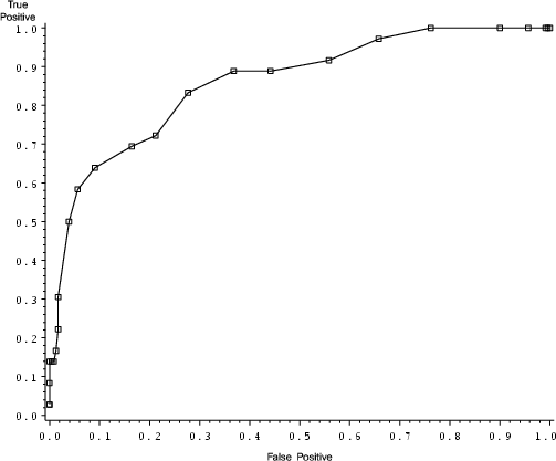
| Figure 12: |
A ROC curve from an uncalibrated risk prediction algorithm. |
|
The relationship between TP and FP for the risk prediction algorithms can be examined graphically by plotting receiver operating characteristic (ROC) curves (13). These curves plot the TP as a function of the FP at all possible decision thresholds. An ROC curve might appear as in figure 12 (21). This curve can be generated with the SAS statements in the program canola1.sas. This program contains a SAS macro that chooses different decision thresholds and tabulates the different values for true and false positive rates, and generates the ROC curve for the original risk algorithm. A program that generates the ROC curve for the recalibrated risk algorithm (the one generated in the previous chapter using the program can_red.sas) can be generated by running the program reduced_roc.sas.
In an ROC curve using our example, the origin of the graph represents the decision 'not-to-spray' for all fields. This decision yields no false positives (i.e. a recommendation to spray in the absence of the need to spray: the quantity B in table 8 is 0) but captures no true positives (recommending a spray for those fields that truly require one: the quantity A in table 8 is also 0). The upper right corner would recommend spraying all fields, thus detecting all fields that truly require a spray (C = 0, TP rate = 1) but also recommending a spray for all fields that do not require them (D=0, FP = 1). An efficient algorithm would yield a curve 'pushed to the upper left corner'.
ROC curves can also be drawn plotting the TP as a function of the TN, or the sensitivity as a function of the specificity (15). This is equivalent to flipping the graphs around a vertical axis, and an efficient algorithm is thus pushed to the upper right corner instead.
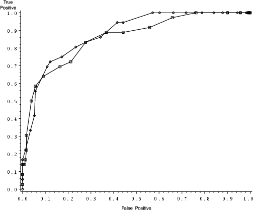
| Figure 13: |
Comparing the original and the recalibrated risk prediction algorithm. (From reference 21, with kind permission of Springer Science and Business Media.) |
|
The use of ROC curves is a method of comparing risk algorithms that does not rely on the algorithms having the same scale. Figure 13 (21) compares two decision algorithms that have different scales but are based on the same data set. This graph can be generated by the SAS program dblroc.sas. It uses data sets created by the programs canola1.sas and reduced_roc.sas, so make sure you have already run both of these programs.
An added advantage of using ROC curves is that it allows for flexibility on the part of the decision maker. Variable decision thresholds, with varying TP and FP rates, can reflect the risk attitudes (named utility functions in the economics literature) of the decision maker. Thus, a risk averse decision maker may set his criteria level further to the right on Figure 13, and spray his fields with a lower 'point accumulation', when compared to a decision maker more willing to take risks. He could thereby increase his true positive rate, but at the cost of increasing his false positive rate. The advantage of the ROC curves is that the rate of both kinds of errors (applying an unneeded spray, and missing a needed spray, in our example) can be estimated. Given these error rates and the relative costs of both kinds of error, the decision maker can determine a critical value for his decision threshold, that reflects his attitudes toward risk.
The development of risk assessment algorithms needs to be guided by the requirements the final algorithms. This is especially important if data are derived from surveys where one is limited by the natural variation in the independent variables and their different combinations. If data from a wide variety of cropping situations (variation in cultivars, cultural practices, climate etc.) are used to develop algorithms, the result may have wider applicability if the data set has captured the necessary variation. Likewise, restricting the variation in the underlying data may not permit the discovery of important factors, merely because they are always present (or absent), though this may not necessarily affect the validity of the resulting algorithm in that particular setting.
An important factor to keep in mind is that a single ROC curve summarises the errors involved for a single economic injury level. This level, of course, is in turn dependent on a number of factors that we have little control over. In practice, it may be more useful to think of a family of ROC curves for different economic injury levels, or an ROC surface plot with the economic injury level as an additional variable (7).
8. Bayes's Theorem and Pest Prediction
The performance of the predictor can be then combined with general information about the occurrence of the pest using Bayes's theorem (20). In Bayesian terms, the general occurrence of the pest can be considered an unconditional probability, representing how often we would expect the pest to occur based on past experience, but without using any season-specific information. These are referred to as priors. Bayes's theorem then allows us to combine the information in the prior (our expectation based on past experience) with the information in the predictor to form a new probability, conditional on this new information. This is referred to as a conditional probability, since it is dependent on the information in the predictor.
In mathematical terms, Bayes's theorem for the simple case with only two possibilities is:
 |
(equation 4) |
where Pr(A) and Pr(B) are unconditional probabilities of A and B and Pr(A) is the probability of not observing A, i.e. Pr(A) + Pr(A) = 1.0. In this case, A represents pest occurrence, and B represents a positive prediction. Note that the sensitivity (Pr(B∣A)) and the unconditional probability of pest occurrence occur in both the numerator and the denominator, and that the false positive rate (Pr(B∣A) also occurs in the denominator.
This can be made easier to handle by using odds of the outcomes and calculating the likelihood ratios (LR) of the positive and negative predictions (20). The likelihood ratio of a positive prediction, denoted LR(A,B), contains contains information about both specificity and sensitivity:
 |
(equation 5) |
Likewise, one can also calculate the likelihood ratio of a negative prediction, denoted LR(A,B):
 |
(equation 6) |
If we rewrite the prior probabilities as odds

we can write instead of equation 4:
 |
(equation 7) |
and also derive a similar relationship for the probability of disease after a negative prediction
 |
(equation 8) |
For example, if a prediction algorithm has a sensitivity of 80% and a specificity of 75%, then the LR for a positive prediction (calculated using equation 5) is

The LR for a negative prediction is

calculated using equation 6.
If the prior odds for needing a spray were 1 in 10 (i.e. the pest occurred only 1 year in 11 or 9%), then after a positive prediction the odds would be (calculated using equation 7)

or about a 24% chance that the pest would occur. After a negative prediction, the odds would be

calculated using equation 8.
How well does this work in practice? One would need information on both sensitivity and specificity of the predictor, along with some general information on disease occurrence. In one example (20), the specificity and sensitivity of a risk algorithm developed by logistic regression (17) on the risk of Sclerotinia stem rot of oil-seed rape were combined with information on prior probabilities (E. Twengström, personal communication).
This study utilized a twenty-year average for the need to apply fungicides to control Sclerotinia stem rot in order to obtain prior probabilities. Several different decision thresholds were used corresponding to Figure 1 in the article originally published by Twengström et al. (18). The 40 point threshold yields approximately equal rates for the two types of errors. A lower decision threshold increases sensitivity at the cost of reduced specificity. A higher decision threshold sacrifices sensitivity for increased specificity. These decision thresholds were combined with the priors based on the twenty-year averages and single highest year values for Uppland and Västmanland. A range of posterior probabilities were obtained.
The authors concluded that for extremely rare or extremely common pests, it is impractical to develop pest prediction systems that will receive widespread acceptance unless they have extremely high sensitivity and specificity. For rare pests, the prior odds of pest occurrence is low, and thus a test with an extremely high LR for a positive test is required in order for the test to increase the odds to the point where action might be taken. In this case, it is the specificity of the test that will increase the LR for a positive prediction. Even if the sensitivity of the test was 100%, a specificity of only 95% will increase the odds only 20-fold.
For common pests, a LR for a negative test will have to be very small in order to reduce the odds of pest occurrence so that no action would be taken. This is achieved by having a test with high sensitivity. If the specificity of a test is 100%, it will still require a sensitivity of 95% in order to reduce the odds of pest occurrence by a factor of 20.
Wider acceptance of predictive systems might be expected for pests that occur about half the time. Even predictors with only modest performance might be used in this situation, since there is no prior information on the occurrence of the pest. For more detailed descriptions of the calculations and a more detailed discussion, the reader is referred to the original paper (20).
9. Notes on installing the SAS programs
The SAS programs shown in table 9 should be available in a compressed archive.
The SAS statements are written assuming that all program files and data sets are in the directory E:\decision. If you choose to place your files in another directory, you will have to make the necessary changes in the SAS programs. This information is in the statements filename and libname at the beginning of the programs. In addition, Unix users may have to change the line delimiter in some of the files in order to avoid errors.
Programs that generate graphs will use windows (or a similar system) to present the on-screen graphs. If you want to generate postscript figures to incorporate into other documents, you may want to change the graphic drive routine in sas as follows (found in change_graph.sas):
|
filename grafout 'e:\decision\figure.ps';
goptions device=ps gsfname = grafout
gsfmode=replace vsize= 12 cm
vorigin=12 cm hsize=15 cm; |
An example of the use of this is the program test_ps_write.sas, which modifies the canola1.sas program to generate a postscript file.
These programs were tested with SAS version 9.1 for Windows, and version 8.2 running under Windows and Linux.
Literature Cited
1. Ahlbom, A., 1993. Biostatistics for Epidemiologists. Lewis Publishers.
2. Campbell, C. L. and Madden, L., 1990. Introduction to Plant Disease Epidemiology. John Wiley and Sons.
3. Crawley, M. J., 1993. GLIM for Ecologists. Blackwell Scientific Publications.
4. Francis, B., Green, M., and Payne, C., 1993. The GLIM System – Release 4 Manual.
5. Gillespie, T. and Sutton, J., 1979. A predictive scheme for timing fungicide applications to control alternaria leaf blight in carrots. Canadian Journal of Plant Pathology 1:95–99.
6. Hosmer, Jr., D. W. and Lemeshow, S., 1989. Applied Logistic Regression. John Wiley and Sons.
7. Hughes, G., McRoberts, N., and Burnett, F., 1999. Decision-making and diagnosis in disease management. Plant Pathology 48:147–153.
8. Jones, D., 1994. Evaluation of fungicides for control of eyespot disease and yield loss relationships in winter wheat. Plant Pathology 43:831–846.
9. Krause, R., Massie, L., and Hyre, R., 1975. BLITECAST: A computerized forecast of potato late blight. Plant Disease Reporter 59:95–98.
10. MacHardy, W. and Gadoury, D., 1989. A revision of Mills's criteria for predicting apple scab infection periods. Phytopathology 79:304–310.
11. McCool, P., Younglove, T., and Musselman, R., 1986. Plant injury analysis: Contingency tables as an alternative to analysis of variance. Plant Disease 70:357–360.
12. McCullagh, P. and Nelder, J., 1989. Generalized Linear Models, 2nd Edition. Chapman and Hall.
13. Metz, C., 1978. Basic principles of ROC analysis. Seminars in Nuclear Medicine 8:283–298.
14. Mills, W., 1944. Efficient use of sulfur dusts and sprays during rain to control apple scab. Bulletin 630, New York Agricultural Experiment Station Ithaca Extension.
15. Murtaugh, P., 1996. The statistical evaluation of ecological indicators. Ecological Applications 6:132–139.
16. Sackett, D. L., Haynes, R. B., and Tugwell, P., 1985. Clinical Epidemiology - A Basic Science for Clinical Medicine. Little, Brown, and Company.
17. Twengström, E., 1999. Epidemiology and Forecasting of Sclerotinia Stem Rot on Spring Sown Oilseed Rape in Sweden. Ph.D. thesis, Swedish University of Agricultural Sciences.
18. Twengström, E., Sigvald, R., Svensson, C., and Yuen, J., 1998. Forecasting sclerotinia stem rot in spring sown oilseed rape. Crop Protection 17:405–411.
19. Vanderplank, J., 1963. Plant Diseases: Epidemics and Control. Academic Press.
20. Yuen, J. and Hughes, G., 2002. Bayesian analysis of plant disease prediction. Plant Pathology 51:407–412.
21. Yuen, J., Twengström, E., and Sigvald, R., 1996. Calibration and verification of risk algorithms using logistic regression. European Journal of Plant Pathology 102:847–854.
22. Zadoks, J. C. and Schein, R. D., 1979. Epidemiology and Plant Disease Management. Oxford University Press.
