The spatial pattern of disease is often analyzed to draw inference about transmission or spread of the disease (Barnes et al. 2005). The spatial patterns of heteroecious rust fungi can be especially interesting. Studies of the spatial scale at which hosts and pathogens interact in natural systems may lead to better understanding of the evolution of resistance or virulence in plant and pathogen populations (Thrall and Burdon 1997).
Patterns of disease depend on the amount of inoculum and the presence of suitable hosts. In contrast to agricultural systems, natural systems often have more than one species as a source of inoculum that will contribute to disease levels (Barnes et al. 2005). A common pathogen found in the tallgrass prairie is Puccinia andropogonis, the causal agent of leaf rust on big bluestem (Andropogon gerardii). Puccinia andropogonis is a macrocyclic, heteroecious rust with a narrow telial host range and a broad aecial host range (Szabo 2006). The most common telial hosts include A. gerardii and Schizachyrium scoparis (little bluestem), while the aecial hosts are found in seven different host families in 17 genera (Szabo 2006). The telial host big bluestem is a native, warm season grass that can be found from the Rocky Mountains to the Atlantic Ocean and is important as forage for both wildlife and domestic animals (Barnes et al. 2005).
Barnes et al. (2005) examined how the distance between Comandra umbellata (the aecial host) and A. gerardii (the telial host) affected rust severity on big bluestem. The objectives of their research included determining the importance of local sources of aeciospore inoculum on rust severity of big bluestem, using spatial autocorrelation analyses to measure disease aggregation on both plant hosts, and establishing whether the genetic background of big bluestem had an effect on rust severity. They found that the spatial structure of the alternate host (Comandra spp.) had a strong effect on aeciospore infection in big bluestem, with comandra plants that were clustered having the greatest effect. The general plant growth dynamics, such as the number of stems produced, also had a significant effect on both total inoculum and rust infection on big bluestem.
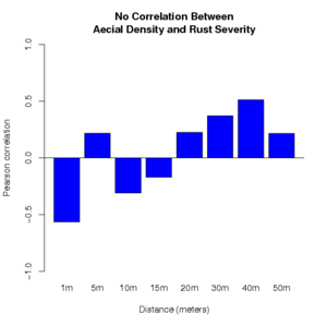
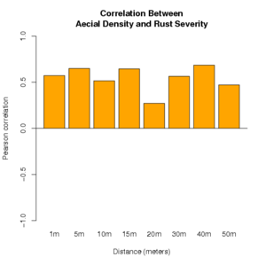
We provide two examples of the use of R to perform a Pearson correlation analysis of the relationship between aecial density on comandra plants and rust severity on big bluestem plants. Bar plots are created to illustrate the relationship for each of a range of distances between the comandra plants and the big bluestem plants being evaluated. Two possible outcomes of such an evaluation are illustrated. In each illustration, there are four replicates for each distance between the two host species.
# This is the first example data set that will be analyzed.
# Distance     Aecial Density          Rust Severity
# (meters)
# 1            47, 39, 42, 50          10, 25, 20, 20
# 5            50, 40, 60, 64          15, 20, 20, 20
# 10           44, 21, 72, 47          25, 35, 30, 20
# 15           40, 32, 51, 76          20, 15, 5, 15
# 20           21, 7, 31, 45           10, 15, 5, 20
# 30           87, 70, 65, 80          30, 15, 30, 30
# 40           15, 21, 37, 41          20, 5, 30, 20
# 50           36, 52, 47, 46          25, 25, 35, 35
# The data are entered here as (x,y) pairs for you.
# The first two are separated for clarity and
# to illustrate what is being entered.
# x1 = Aecial density at 1 meter
# y1 = Rust severity at 1 meter
x1=c(47, 39, 42, 50)
y1=c(10, 25, 20, 20)
# The remainder of data to be entered follow
x2=c(50, 40, 60, 64)
y2=c(15, 20, 20, 20)
x3=c(44, 21, 72, 47)
y3=c(25, 35, 30, 20)
x4=c(40, 32, 51, 76)
y4=c(20, 15, 5, 15)
x5=c(21, 7, 31, 45)
y5=c(10, 15, 5, 20)
x6=c(87, 70, 65, 80)
y6=c(30, 15, 30, 30)
x7=c(15, 21, 37, 41)
y7=c(20, 5, 30, 20)
x8=c(36, 52, 47, 46)
y8=c(25, 25, 35, 35)
# Perform Pearson correlation for each of the
# distances being evaluated.
dist1 <- cor(x1,y1, method="pearson");
dist2 <- cor(x2,y2, method="pearson");
dist3 <- cor(x3,y3, method="pearson");
dist4 <- cor(x4,y4, method="pearson");
dist5 <- cor(x5,y5, method="pearson");
dist6 <- cor(x6,y6, method="pearson");
dist7 <- cor(x7,y7, method="pearson");
dist8 <- cor(x8,y8, method="pearson");
# Create a bar chart of the correlation values
bars <- c(dist1, dist2, dist3, dist4,
          dist5, dist6, dist7, dist8);
#Label X-axis, displayed below the bars
names(bars) <- c("1m","5m","10m","15m",
                 "20m","30m","40m","50m");
#Create a barplot of the Pearson correlations
barplot(bars, ylim=c(-1,1), col="blue",
        xlab="Distance (meters)",
        ylab="Pearson correlation");
#Draw line at 0 across the plot
abline(h=0)
#Put a title on the graphic, the \n
#   creates a line-break in the title
title(main=
  'No Consistent Correlation Between\nAecial Density and Rust Severity'
)
Output

Click to enlarge.
Here is an alternative result to illustrate another possible outcome.
# Distance     Aecial Density          Rust Severity
# 1            10, 21, 26, 19          5, 15, 10, 5
# 5            25, 31, 17, 28          5, 10, 5, 15
# 10           45, 36, 24, 27          15, 20, 10, 15
# 15           77, 65, 40, 45          20, 20, 10, 20
# 20           33, 46, 55, 51          5, 10, 5, 10
# 30           48, 25, 56, 61          20, 20, 20, 25
# 40           80, 74, 61, 54          35, 35, 10, 25
# 50           62, 49, 53, 60          20, 20, 15, 25
x1=c(10, 21, 26, 19)
y1=c(5, 15, 10, 5)
x2=c(25, 31, 17, 28)
y2=c(5, 10, 5, 15)
x3=c(45, 36, 24, 27)
y3=c(15, 20, 10, 15)
x4=c(77, 65, 40, 45)
y4=c(20, 20, 10, 20)
x5=c(33, 46, 55, 51)
y5=c(5, 10, 5, 10)
x6=c(48, 25, 56, 61)
y6=c(20, 20, 20, 25)
x7=c(80, 74, 61, 54)
y7=c(35, 35, 10, 25)
x8=c(62, 49, 53, 60)
y8=c(20, 20, 15, 25)
dist1=cor(x1,y1, method="pearson")
dist2=cor(x2,y2, method="pearson")
dist3=cor(x3,y3, method="pearson")
dist4=cor(x4,y4, method="pearson")
dist5=cor(x5,y5, method="pearson")
dist6=cor(x6,y6, method="pearson")
dist7=cor(x7,y7, method="pearson")
dist8=cor(x8,y8, method="pearson")
bars <- c(dist1, dist2, dist3, dist4,
          dist5, dist6, dist7, dist8);
#Label for X-axis displayed below the bars
names(bars) <- c("1m","5m","10m","15m",
                 "20m","30m","40m","50m");
#Create a barplot of the Pearson Correlations
barplot(bars, ylim=c(-1,1), col="orange",
        xlab="Distance (meters)",
        ylab="Pearson correlation");
#Draw line at 0 across the plot
abline(h=0)
#Put a title on the graphic
title(main=
  'Correlation Between\nAecial Density and Rust Severity'
)
Output

Click to enlarge.
The estimated correlation for the first data set does not show a consistent correlation between aecial density and rust levels on the big bluestem. The second example shows a consistent positive correlation between the two variables. A more complete analysis could include tests of significance for each distance.
Next, using Lloyd's Index of Patchiness to study aggregation.
