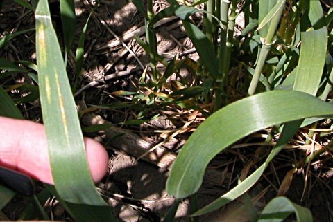
Stripe rust caused by Puccinia striiformis on hard red winter wheat. Characteristic yellow stripes of pustules appear on leaves when plants are infected. Photo courtesy A. Sparks, Kansas State University, Manhattan, Kansas.
For many spores of plant-pathogenic fungi, air (wind) is the primary mechanism supporting long-distance dispersal (LDD). Sackett and Mundt (2005) used wheat stripe rust, caused by Puccinia striiformis, as a model system for studying LDD. Puccinia striiformis is a fungus producing powdery masses (pustules) of yellow spores in expanding lesions which form stripes on the leaf surface. Spores of P. striiformis are primarily wind dispersed. At two different locations, Madras and Hermiston (Oregon, US), aerial dispersal was measured in the spring of 2002 and 2003. Assessments were made from the center of the focus in both the upwind and downwind directions, where the prevailing wind was from the west. A plot of data from Sackett and Mundt (2005), using the curve function, has previously been shown in this document. The following R example will provide exercises to compare some of the scenarios that were observed by Sackett and Mundt (2005). Data will be provided for each scenario and the following equations will be examined.
Table 3. Dispersal gradient models examined by Sackett and Mundt (2005) to study primary disease gradients of wheat stripe rust in Oregon.
| Model |
Nonlinear equation |
Linearized form used for Analysis
(Table 1 and Fig. 3 in
Sackett and Mundt (2005)) |
|
Exponential |
y=ae-bs |
ln(y)=ln(a)-bs |
|
Power |
y=as-b |
ln(y=ln(a)-bln(s) |
|
Modified power |
y=a(s+c)-b |
ln(y)=ln(a)-bln(s+c) |
|
Lambert |
y=aebsc |
ln(y)=ln(a)-bsc |
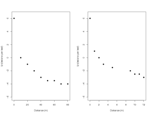
Data provided will include adapted raw data based on Figures 3A and 3B of Sackett and Mundt (2005), as well as the parameter estimates obtained for some of the experiments in Table 1 of their paper. This provides an example of dispersal downwind and upwind direction from the inoculum source.
##First, set up the distance from source (in meters)
#Set up downwind and upwind examples
#Y or the ln-lesions per leaf is presented

distance_downwind=c(0,10,20,30,40,50,60,70,80)
downwind =c(6,0,-1,-2,-3,-3.5,-3.5,-4,-4)

distance_upwind=c(0,1,2,3,5,9,10,11,12)
upwind<- c( 6,1,0,-1,-1.5,-2,-2.5,-2.5,-3)

#Plot the adapted raw data from Sackett and Mundt (2005)
par(mfrow=c(2,2))
plot(
  distance_downwind,
  downwind,
  ylim=c(-6,6.5),
  pch=19,
  col='black',
  xlab="Distance (m)",
  ylab="Ln(lesions per leaf)",
  main="Downwind"
)

plot(
  distance_upwind,
  upwind,
  ylim=c(-6,6.5),
  pch=19,
  col='black',
  xlab="Distance (m)",
  ylab="Ln(lesions per leaf)",
  main="Upwind"
)
Which leads to:
Output

Click on the image for larger version.
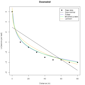
Using the curve function, the different models can be compared: see the introduction to these exercises for different models that may be used. As an example:
par(mfrow=c(1,1))

#Define the respective parameters for each model
#   for the downwind dispersal gradient
a.exp=18.59
b.exp=0.106

a.power=184.9
b.power=2.07

a.mod.power=431.8
b.mod.power=2.29
c.mod.power=0.848

a.lambert=895.5
b.lambert=2.85
c.lambert=0.312

#Define the maximum distance (s = x) for plotting the curve
xmax=80

#Plot the raw data using the same code from
#   above, for the downwind gradient

plot(
  distance_downwind,
  downwind,
  ylim=c(-6,6.5),
  pch=19,
  col='black',
  xlab="Distance (m)",
  ylab="Ln(lesions per leaf)",
  main="Downwind"
)

#Create a series of curves for each model and
#   overlay them on the raw data graph.
#   The plots represent the linearized form

curve(log(a.exp)-b.exp*x,
          from=0, to=xmax, add=TRUE, lty=1, col='black')
curve(log(a.power)-b.power*log(x),
          from=0,to=xmax,add=TRUE,lty=1,col='mediumblue')
curve(log(a.mod.power)-b.mod.power*log(x+c.mod.power),
          from=0,to=xmax,add=TRUE,lty=1,col='green')
curve(log(a.lambert)-b.lambert*x^c.lambert,
          from=0,to=xmax,add=TRUE,lty=1,col='orange')

legend(
  'topright',
  c("Raw data","Exponential","Power",
    "Modified power","Lambert"),
  pch=c(19,NA,NA,NA,NA),
  lty=c(NA,1,1,1,1),
  col=c('black','black','mediumblue','green','orange'),
  inset=0.02
)

Click on the image for larger version.
If the coefficients of determination (R2) were 0.776, 0.990, 0.987, and 0.962, respectively, which model would you choose to best describe the dispersal process?
Suggested exercise
To make the same comparison for the upwind direction, plot the raw data and then overlay the four curves using the following information.
Table 4:Parameter estimates and R2 for upwind data
|
Model |
a |
b |
c |
R2 |
|
Exponential |
10.91 |
0.658 |
… |
0.728 |
|
Power |
4.907 |
2.28 |
… |
0.969 |
|
Modified power |
6.912 |
2.42 |
0.180 |
0.988 |
|
Lambert |
452.0 |
4.84 |
0.310 |
0.987 |
Next, advanced exercises - simulating an epidemic
