Real, L., and McElhany, P. 1996. Spatial Pattern and Process in Plant-Pathogen Interactions. Ecology 77:1011-1025.
Plants have a property that is very convenient for studies of disease spread: they are stationary. We can analyze the spatial pattern of diseased plants within a plant population to gain insight into how the disease has spread, how the disease will continue to spread, and what methods could be used to effectively control disease spread.
There are many ways to approach the analysis of the spatial pattern of disease. One approach is to define what it means for plants in a plot to be "close" to one another, and then determine whether plants that are close to each other are likely to have similar characteristics. This approach was taken in the previous section where the disease severity of an individual plant was estimated as the mean of the plants defined as neighbors.
Real and McElhany (1996) discussed several methods for spatial analysis of plant populations, and applied these methods to a data set describing a population of Silene latifolia and the incidence of the anther-smut fungus, Microbotryum violaceum. Here we review the methods they discuss to define proximity of plants. Then we describe a variogram analysis, one method for studying how similar are the responses of plants at different distances apart.
Often data for analysis of spatial pattern are in the form of a map of locations where infection has occurred. In natural systems where the arrangement of plants is not regular, the positions of non-infected plants may be needed to complete the map. To describe the plant population pattern, a grid can be imposed on the plot so that plant density can be evaluated in each square. Then the similarity in plant density for grid cells at different distances apart can be assessed. This analysis assumes a definition of distance between grid cells. The most common approach is to define connections based solely on the Euclidean distance between two cells; the distance is often called the "lag distance", notated by h. Another option is to take direction into consideration. In this case, start with one cell and consider it paired with cells that are in a certain direction and separated by distance h. The direction could be the "rooks move" (in the vertical and horizontal directions), the "bishops move" (along the diagonal), or defined by some other degree increment that partitions the full 360 degree range. Once the distance and directions have been chosen, a scatterplot of the response variable in appropriate plots can be used to explore the relationship. For example, along one axis might be the plant density for reference spatial points Z, and along the other axis might be plant densities for cells separated from each point Z by a selected lag distance, either omnidirectionally or along a selected direction.
Evaluating a map of infection points
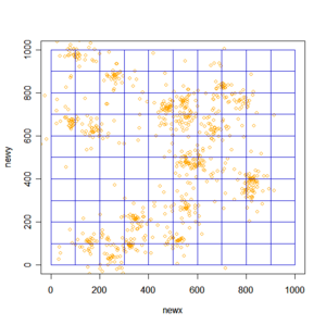
Here's an example in which we generate a map of infections using R and then analyze their pattern using Geary's c, a measure of similarity described below. The first step is to generate a map using the disperse2 function that was introduced in Esker et al. (2007). Then grid cells are superimposed over the map and the number of infections in each grid cell is evaluated. (Note that, while the locations of infections are generated using pseudorandom numbers, only the first generation of locations is in a random pattern. The following generations of infections tend to be near the original source of infection so the pattern becomes more aggregated as more generations pass.)
# nstart is the number of initial infections
# nnew is the number of new infections produced by
#      each pre-existing infection each generation
# ngen is the number of generations
# exppar is the rate parameter for the exponential
#      distribution
disperse2 <- function(nstart, nnew, ngen, exppar){
  coord <- matrix(runif(n=2*nstart, min=0, max=1000),
             nrow=nstart, ncol=2)
  ntot <- nstart
  if(ngen > 0){
    for(i in 1:ngen){
      for(j in 1:ntot){
        tempx <- coord[j,1]
        tempy <- coord[j,2]
        newdir <- runif(n=nnew, min=-pi, max=pi)
        newdist <- rexp(n=nnew, rate=exppar)
        newx <- tempx + newdist * sin(newdir)
        newy <- tempy + newdist * cos(newdir)
        newcoord <- cbind(newx,newy)
        coord <- rbind(coord,newcoord)
      }
    }
    ntot <- length(coord[,1])
  }
  coord
}
# Create the list of coordinates for infection points
tmat <- disperse2(nstart=20, nnew=20,
                  ngen=2, exppar=0.02)
# Plot the map of infection points
plot(tmat, xlim=c(0,1000), ylim=c(0,1000),col='orange')
# Draw lines indicating the sampling quadrats,
#    or grid cells
for (i in seq(from=0,to=1000,by=100)){
  lines(c(i,i),c(0,1000),col='mediumblue')
  lines(c(0,1000),c(i,i),col='mediumblue')
}
# Collect the counts from each of the quadrats,
#    or grid cells
quad <- function(inmat){
  quadcount <- matrix(-1,10,10)
  for (x in 1:10){
  for (y in 1:10){
      lowx <- 100*(x-1)
      highx <- 100*x
      lowy <- 100*(y-1)
      highy <- 100* y
      testx <- inmat[,1] > lowx & inmat[,1] < highx
      testy <- inmat[,2] > lowy & inmat[,2] < highy
        # ... this essentially rotates the matrix of values
        # to make comparison to the graph more direct
      quadcount[(11-y),x] <- sum(testx*testy)
    }
  }
  quadcount
}
quadout <- quad(tmat)
quadout
Output
Note that the data set is generated randomly, so the pictures and data shown below will be somewhat different from those produced by submission of the same commands again.
     [,1] [,2] [,3] [,4] [,5] [,6] [,7] [,8] [,9] [,10]
 [1,]  9   17    5    1    1    1    4    0    0     0
 [2,]  3    0   29    4    2    4    7   23    2     0
 [3,]  4    1    2    2   32   37   11   26    7     0
 [4,] 27   28    5    2   10   29   24    8    1     1
 [5,]  0    5    4    1    4   10   12    4    2     0
 [6,]  1    0    0    0    0   39   20    7   16     0
 [7,]  0    0    1    1    2    8    2    9   40     1
 [8,]  0    1    2   24    8   26    3    1    5     0
 [9,]  2   22    9   21    9   20    2    0    0     0
[10,]  3   11   28   21    4    6    0    0    0     0

Click to enlarge.
Geary's c
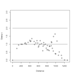
Geary's c is one measure for evaluating similarity or dissimilarity for quadrats at specific distances from each other. Here we develop a function to calculate Geary's c, but R offers other functions to calculate it, as well. Geary's c generally varies from 0 (strong positive autocorrelation) to 2 (strong negative autocorrelation), with 1 being the expected value when there is no spatial autocorrelation (Cliff and Ord 1981). The value at a distance of h is:  .
.
W(h) are the total number of pairs in the data set for distance h
wij(h) is an indicator taking on the value 1 if the two observations i and j are at distance h, and the value 0 if they are not
zi is the observation (in our case, count) for the ith location (with coordinates xi and yi.)
At one rook's move, the distance from center to center of neighboring quadrats is 100.
At one bishop's move, the distance from center to center of neighboring quadrats is
sqrt(100^2 + 100^2)
141.4214.
At two rook's moves, the distance is 200.
At two bishop's moves, the distance is
sqrt(200^2 + 200^2)
282.8427.
The 100x100 matrix of distances between the 100 quadrats is given by the following. First, calculate matrices of x and y coordinates for the center of each quadrat. (When the matrices are converted to vectors, R does this by pasting together the columns (y values) end to end).
# First, calculate matrices of x and y coordinates
#    for the center of each quadrat.
# (When the matrices are converted to vectors,
#     R does this by pasting together the
#     columns (y values) end to end).
xcoord <- matrix(-1,10,10)
for (i in 1:10){xcoord[,i] <- i*100 - 50}
xcoord <- as.vector(xcoord)
ycoord <- matrix(-1,10,10)
for (i in 1:10){ycoord[i,] <- i*100 - 50}
ycoord <- as.vector(ycoord)
# Calculate the 100x100 distance matrix that includes
#    the distance between each pair of quadrats
distmat <- matrix(-1,100,100)
for (i in 1:100){
 for (j in 1:100){
    distmat[i,j] <- sqrt((xcoord[i]-xcoord[j])^2 +
                      (ycoord[i]-ycoord[j])^2)
  }
}
# Find the unique distances that we have to work
#    with for this quadrat arrangement
ulist <- unique(as.vector(distmat))
ulist
Output
 [1]    0.0000  100.0000  200.0000  300.0000  400.0000  500.0000  600.0000
 [8]  700.0000  800.0000  900.0000  141.4214  223.6068  316.2278  412.3106
[15]  509.9020  608.2763  707.1068  806.2258  905.5385  282.8427  360.5551
[22]  447.2136  538.5165  632.4555  728.0110  824.6211  921.9544  424.2641
[29]  583.0952  670.8204  761.5773  854.4004  948.6833  565.6854  640.3124
[36]  721.1103  894.4272  984.8858  781.0250  860.2325  943.3981 1029.5630
[43]  848.5281 1000.0000 1081.6654  989.9495 1063.0146 1140.1754 1131.3708
[50] 1204.1595 1272.7922
Next find the number of unique distances.
# Find the number of unique distances
length(ulist)
Output
[1] 51
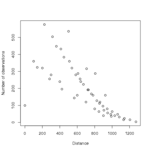
Now create a graph that shows the number of observations for each distance.
# Calculate the number of observations
#    corresponding to each distance, W(h)
wdvec <- 0*(1:length(ulist))
for (i in 1:length(ulist)){
  wdvec[i] <- sum(as.vector(distmat) == ulist[i])
}
# Note that the number of pairs per distance
#    varies greatly
plot(ulist, wdvec, xlab='Distance',
     ylab='Number of observations')

Click to enlarge.
# Calculate the denominator,
#    [(1/(n-1)) ∑i=1 n (zi - mean(z))]
meanz <- mean(quadout)
quadvec <- as.vector(quadout)
sum1 <- 0
for (i in 1:100){sum1 <- sum1 + (quadvec[i] - meanz)^2}
denom <- (1/99) * sum1
# Calculate the second part of the numerator for each
# distance, [∑i=1(i≠j) n ∑j=1(i≠j) n wij(h) (zi - zj)2]
numer <- 0*(1:length(ulist))
for(k in 1:length(ulist)){
tdist <- ulist[k]
dcheck <- distmat == tdist
for(x in 1:100){
for(y in 1:100){
if(dcheck[x,y] & x != y){
numer[k] <- numer[k] + (quadvec[x] - quadvec[y])^2
}
}
}
}
# Finally calculate Geary's c(h) for each distance h
Gearyout <- 0*length(ulist)
for (i in 1:length(ulist)){
  Gearyout[i] <- (1/(2*wdvec[i])) * numer[i] / denom
}
# Plot Geary's c vs. distance
plot(ulist, Gearyout, xlab='Distance',
     ylab='Geary c', ylim=c(0,3))
lines(c(0,1272),c(0,0))
lines(c(0,1272),c(1,1))
lines(c(0,1272),c(2,2))
These commands can be condensed somewhat into the following function, and output is illustrated following the code to create the new function. Note that the Gearyc function assumes the existence of the quad function.
# Here's a slightly condensed function that
#    performs all these steps
# It assumes existence of the quad function
Gearyc <- function(tmat){
  quadout <- quad(tmat)
  xcoord <- matrix(-1,10,10)
  for (i in 1:10){xcoord[,i] <- i*100 - 50}
  xcoord <- as.vector(xcoord)
  ycoord <- matrix(-1,10,10)
  for (i in 1:10){ycoord[i,] <- i*100 - 50}
  ycoord <- as.vector(ycoord)
  distmat <- matrix(-1,100,100)
  for (i in 1:100){
    for (j in 1:100){
      distmat[i,j] <- sqrt((xcoord[i]-xcoord[j])^2 +
                  (ycoord[i]-ycoord[j])^2)
    }
  }
  ulist <- unique(as.vector(distmat))
  wdvec <- 0*(1:length(ulist))
  for (i  in 1:length(ulist)){
    wdvec[i] <- sum(as.vector(distmat) == ulist[i])}
  meanz <- mean(quadout)
  quadvec <- as.vector(quadout)
  sum1 <- 0
  for (i in 1:100){sum1 <- sum1 + (quadvec[i] - meanz)^2}
  denom <- (1/99) * sum1
  numer <- 0*(1:length(ulist))
  for(k in 1:length(ulist)){
    tdist <- ulist[k]
    dcheck <- distmat == tdist
    for(x in 1:100){
      for(y in 1:100){
        if(dcheck[x,y] & x != y){
          numer[k] <- numer[k] + (quadvec[x] - quadvec[y])^2
        }
      }
    }
  }
  Gearyout <- 0*length(ulist)
  for (i in 1:length(ulist)){
    Gearyout[i] <- (1/(2*wdvec[i])) * numer[i] / denom
  }
  plot(ulist, Gearyout, xlab='Distance',
       ylab='Geary c', ylim=c(0,3))
  lines(c(0,1272),c(0,0))
  lines(c(0,1272),c(1,1))
  lines(c(0,1272),c(2,2))
}
# For a new map, evaluate Geary's c
tmat <- disperse2(nstart=20, nnew=20, ngen=2, exppar=0.02)
Gearyc(tmat)
Output

Click to enlarge.
Variograms
A variogram can be used to summarize the relationship at each distance between points (individuals or grid cells). The variogram value  , or estimated semivariance, for lag distance h is defined as:
  , where N(h) is the number of pairs of points separated by h, z(xi) is the data value for the point xi, and z(xi+h)is the data value at cells separated from xi by the lag distance h in the chosen direction.
Variograms can be used to evaluate whether plant characteristics such as disease incidence are clustered or random. Clustered disease incidence would be reflected in positive values in the variogram at the distances corresponding to the spatial scale of clustering. If incidence is clustered, "neighbors" are more likely to share the same disease status than are plants separated by larger distances.
In the analysis of their Silene latifolia data set, Real and McElhany (1996) found that plant density was clustered, or had significant autocorrelation, at lag distances up to 4 m. They also found that there was significant autocorrelation of plants with similar disease status at lag distances up to 1 m using an omnidirectional variogram.
Suggested Exercises
Suggested Exercise #1
Try creating other maps with different degrees of clustering by modifying the example above and calculate the number of infections in each quadrat, or grid cell. Then use the matrices of grid cell counts and re-run the exercise above to compare the results to the first map analyzed.
Suggested Exercise #2
Try using a variogram to study the Verticillium wilt case study data. Would information from a variogram be more useful than LIP if the goal is to develop a strategy to control Verticillium wilt?
Next, a discussion on using Beta-binomial analysis
